ShopDreamUp AI ArtDreamUp

Deviation Actions


Suggested Deviants


Suggested Collections


You Might Like…


Featured in Groups


Badge Awards
Description
EDIT:
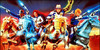
Nimrod, Buzzwang, MaCross and Cpt. Walsh are now added and some color changes.
No Guts No Glory.
[link]
Inks and colors by me
Sketches and composition by
Collab with the always awesome Depper Dan. We had a galaxy Rangers collab in our minds 2 years ago. And now we finally did something together and i love it.
The show was one of the best from the 80s stuff we recieved. Form all Intros, had GR the best intro and the best sound. The character design and setting was very creative. Only prob was, that the show itself could not really hold the quality of the intro and some episodes were really bad written and bad animated. But that was the fate of many Shows from the 80s.
Galaxy Rangers has still the potential to get remaked and with a higher budget and a bigger animation team it could bash anything on TV nowadays.
~Dirk
Image size
623x1143px 238.84 KB
© 2009 - 2024 Themrock
Comments155
Join the community to add your comment. Already a deviant? Log In
Hello how are you !? I hope good.
First that all excellent work, the line and the rate that it has is very good, you make a super composition , the only thing that I see is that can be much more interesting if you added shades and highlights, therefore him a little depth and We can know where the light comes, as far as the colors only seems to me that in some sites you have a little risk of which they are united, but generally this super ones or as always
I really like the background it looks perfect to me
(sorry for my english)